Brand guidelines
The building blocks of the KAMEO identity. Use these consistently across every surface.
The KAMEO mark
The wordmark sets KAMEO in bold, geometric Txt_IV50 with a mint emblem of two overlapping diagonal rectangles behind the letter M. Keep clear space around it and never distort it.

Wordmark — for dark backgrounds
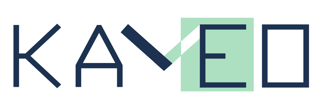
Wordmark — for light backgrounds
The KAMEO icon
The KAMEO icon is built from 34 geometric vectors that come together to form two joined palms — the gesture of Namaste in India and the wai in Thailand. It's a universal sign of respect and welcome, and a reflection of how we work: we put the people we serve first, greeting every customer with humility and care.

Icon — for dark backgrounds
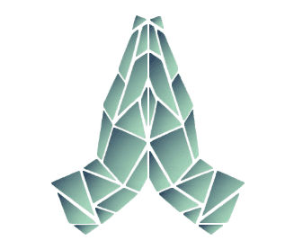
Icon — for light backgrounds
Two colors, used everywhere
KAMEO uses a two-color palette across all products for a consistent, minimal look.
Deep Navy
Primary brand color#1D3251
RGB 29, 50, 81
Mint Green
Accent color#ADE1C2
RGB 173, 225, 194
A single typeface: Txt_IV50
KAMEO uses one typeface across all products, giving everything a distinct, technical character.
AI Infrastructure for Real-World Engineering
ABCDEFGHIJKLMNOPQRSTUVWXYZ
abcdefghijklmnopqrstuvwxyz 0123456789
Display
Used for headlines and the wordmark. Bold and geometric.
Labels
Uppercase with wide tracking for eyebrows and technical labels.
Body
The same Txt_IV50, sized with comfortable line height for long-form readability.